About Me

My photo
Spofford, New Hampshire, United States
Jeff Newcomer had been a physician practicing in New Hampshire and Vermont for over 30 years. Over that time, as a member of the Conservation Commission in his home of Chesterfield New Hampshire, he has used his photography to promote the protection and appreciation of the town's wild lands. In recent years he has been transitioning his focus from medicine to photography, writing and teaching. Jeff enjoys photographing throughout New England, but has concentrated on the Monadnock Region and southern Vermont and has had a long term artistic relationship with Mount Monadnock. He is a featured artist in a number of local galleries and his work is often seen in regional print, web publications and in business installations throughout the country. For years Jeff has published a calendar celebrating the beauty of The New England country-side in all seasons. All of the proceeds from his New England Reflections Calendar have gone to support the Pulmonary Rehabilitation Program at the Cheshire Medical Center. Jeff has a strong commitment to sharing his excitement about the special beauty of our region and publishes a blog about photography in New England.
Showing posts with label editing. Show all posts

Monday, February 24, 2020

Iceland and Introduction to Adobe Lightroom Course


Gullfoss Falls

I’ve got a couple of major projects competing for my attention right now.  Actually three, but my taxes are nearly complete.  It is always surprising when I discover that I made money.  As usual, last year it was not much, not enough to live on, but for a landscape photographer anything in the positive is good news.  The other two demands on my attention are even better.


Drowning Pool, Pingvellir National Park, Iceland
First Susan and I just returned from a to brief, long-weekend, trip to Iceland.  I have always wanted to shoot in Iceland, and we managed to stuff a lot in a short period of time.  This tour convinced me that I must go back for a longer visit, likely in a warmer season.  I came home with over 400 images to work on, and that has reminded me about how dependent I am Adobe Lightroom as an essential part of my picture editing workflow.

Shameless Self-Promotion
Pingvellir Gorge
I am excited about my up-coming Introduction to Adobe Lightroom Classic Course.  The course will meet on six consecutive Tuesday evenings from March 3rd through April 7th at 6pm.  It will be a small group gathered around my dining room table in Spofford New Hampshire.  There are a couple of spaces still open, so get in touch if you are interested in learning about improving and organizing your images with this amazing program.  For more information, check out my article about my spring teaching schedule or give me a call at 603-363-8338.

Given the Power of Lightroom, Is Photoshop Necessary?
People often ask how much of my image editing is done in Lightroom and how much in Photoshop.  I feel strongly that, given the power and ease of use, for the majority of digital photography enthusiasts, Lightroom is all they will need to get started with image editing.  In my own workflow, I use Lightroom for my RAW editing, but I still routinely finish by moving my images to Photoshop for varying degrees of final touch-up.  Often after my full Lightroom adjustments, there is little to do.  I scan the image for small imperfections, dust spots or other distractions that I find easier to remove using Photoshop’s healing bush or cloning tool.  Subtle local adjustments in lighting or color can be applied more precisely using layer masks, and of course, manipulations of pixels can best be performed from within Photoshop. 


Pingvallavatn Lake

I almost always find something to do in Photoshop to complete my image, but how much of a difference does it really make and how much time do I spend using each of these often-complimentary programs?  I usually tell people that I get 80-90% of my image editing done in Lightroom, but that is just a guess.  I decided to look at the question in more detail as I edited some of my Iceland pictures.


Steaming, Geysir Hot Springs
The plan was to measure how much time I spent using the two programs, and also compare the images that resulted from work in  Lightroom Classic to that at the end of my Photoshop “touch-up”.   I realize that time spent was not necessarily an accurate measure of the contributions made by each program.  Lightroom’s intuitive workflow allows for substantial improvements in a relatively short period of time, while subtle refinements in Photoshop can often require more prolonged work.   These examples do not include the time that I spend getting the image ready for a full size JPG upload to the cloud (my web site) and reducing the image size for use on my website.

Lightroom vs Photoshop

Three Little Horses
Final Web Image
Let me start with an easy one.  All over Iceland you will notice groups of small horses seeming to be totally oblivious to the wind and cold.  In years past these cute guys were beasts of burden, but now, I am assured, their only job is to look cute at the side of the road and attract tourist to stop for a petting party.  We found this trio shortly after our visit to the Geysir hot springs.  All adorable, but my favorite shot came when one found the need to comment.

Lightroom Edit
Lightroom: This was an easy edit.  I adjusted the whites and highlights to retrieve some detail in the snow, while setting the black point.  I boosted vibrance slightly and added a bit of texture and clarity.  I usually save cropping for later in Photoshop, but here it was obvious that I had to get rid of the elbow protruding on the left. A bit more work than usual : 15:00 minutes


Photoshop Edit
Photoshop: This is one of those situations where there was little to add with Photoshop.  I used my favorite Shadow/Highlight Tool to add a bit more detail to the wind scoured snowy ground.  I darkened and brought out the color of the hair.  Finally, I drew the eye to the ”laughing” horse with a subtle splash of light.  And I was done.  I normally do a little sharpening in Lightroom, but I don’t sharpen in Photoshop until I am ready to output the image for a specific size and purpose.  Sounds like a lot but only 7:50 minutes
Total :  22:50 Minutes

Gullfoss Falls
One of Iceland’s most dramatic waterfalls is the Gullfoss Falls.  It was truly breathtaking, but what also robbed me of breath was the hurricane force wind that was screaming up the Hvita River Gorge.   I would have loved to spend time exploring all the different angles of this amazing spot, but given the conditions, I could only find two spots that allowed me to stand with a desperate margin of safety. How I avoided being blown away is a story for another time.  Back at home I tried to make the best of what I got.

Lightroom Edit
Lightroom:  My first concern was to avoid blowing out the highlights in the snow and water, especially in the waterfalls.  I dropped down on the highlight slider while watching to avoid making the foreground snow appear a muddy gray.  While setting the dark tones I was careful to avoid losing detail in the rocks. I added a little Texture, Clarity, Vibrance and a touch of sharpening.   As usual, I corrected the Chromatic Aberration.  I reserve cropping for later. 6:12 minutes

Photoshop Edit
Photoshop:  In Photoshop, I started by using the arrange tool to compare four versions of this image, side-by-side.  Studying all the images at 100% magnification I was able to find one that was reasonably sharp.  As my camera and I were being violently blown about, it was surprising that any of the images were sharp. Next, I used the Hue/Saturation Tool to bring out the blue in the water and ice.  Finally, I went into the Camera RAW filter to apply a bit more texture and Clarity.  I planned to use a layer mask to apply this effect just to the falls, but in the end, I liked how adjustment brought out the rugged appearance across the image. 11:52 Minutes
Total : 18:02 Minutes

The Results
I did the time comparison on two other images, both shots I took at the Geysir Hot Springs.  For the record, here are the average times for all four:
Lightroom:  13:30
Photoshop: 16:09

And for completeness, the average time spent fine tuning, cropping, and sharpening for output of a high resolution, full size JPG to the cloud and resizing and sharpening of the approx. 400kb web image:
11:15 Minutes

Grand Total: 40:58

Photoshop Edit
Note the detail in the water
Hot Pot, Geysir Hot Springs
Lightroom Edit

Too Much Time?
Leif Erikson
Hallgrimskirkja Cathedral, Reykjavik
Forty minutes for one image, and these were nor especially challenging.  I can spend hours removing a dense net of wires if the underlying image is strong enough.  I know some very good photographers who say that if they can’t finish editing in about 5 minutes, they throw out the image.  I think they may be missing some great shots.  Personally, I know how hard I work to get in the right spot and strive to get the best digit image in the camera.  For me, no amount of time is too much in the service of bringing an image to its full glory.  As Ansel Adams said, the original negative (or now the raw file) is the score and the final print or image is the performance.  I think that these images show that you can create great performances with Lightroom.  The differences in the Photoshop image are subtle, and I should note that I could have performed more refinements in Lightroom, if I didn’t plan to move the image to Photoshop for further work

Reykjavik Iceland

So get going with Lightroom and if you need some place to start, I will be happy to welcome you at my dining room table next week.

For more pictures of Iceland check out my Iceland Gallery.  I will be adding more images over time.

Sunday, June 10, 2018

Content Aware Fill , More Photoshop "Magic"


There is no question, learning Adobe’s Photoshop can be an intimidating endeavor.  The program is so imposing and powerful that many are frightened away before even trying.  It took me several books and courses before I felt that I could begin to use at a small part of this amazing tool.  The fact is that Photoshop is so deep that, I suspect that no one person can fully understand it all.


Chesterfield Donkey
My approach has always been to decide what I wanted to do for my images, and then discover how to use the parts of Photoshop which would help accomplish that goal.  I didn’t worry about everything that Photoshop can do, just those things that I can use.

Of course, when starting, there are a few basic tools that are important to understand.  Importing images, layers, selections and the basic image controls are essential, but what about all that other stuff.  You can go a long way without having to worry about, HDR, panoramic merging, and split toning, but it’s nice to know that all these tools are there just waiting for you to explore – when needed.

One of these tools, which is fairly new, is Content Aware Fill.  Like many of the new tools, Content Aware Fill (CAF) just provides an easier way to do something that you could do before.  It has always been possible to use the Cloning Tool to fill unwanted areas of an image with pixels taken from other parts of the image, or even from another image.  This can be arduous, as you try to find areas that blend seamlessly with the underlying content and texture.  The cloning brush is still an essential tool, but given the right situation, Content Aware Fill can use the amazing computational power of Photoshop to automate a large portion of the job.

Content Aware Fill

In the Edit drop-down menu, Photoshop provides a list of options to fill an area of an image.  A selection can be filled with the current foreground or background color, a pattern or any color you choose.  This is also where the content aware tool is found.  After creating a selection around an unwanted area of the image (eg my face), Content Aware Fill will attempt to fill the area with pixels from around the selection.  It works to blend the fill with the surroundings.  It doesn’t always work perfectly, but often the results are almost magical.  Typically, the filled area can benefit from a bit of touching up with the Cloning Brush or the Healing Brush. I thought of this as I was working on a picture of a pasture lane in Chesterfield.


Pasture Lane
The Leaning Lane
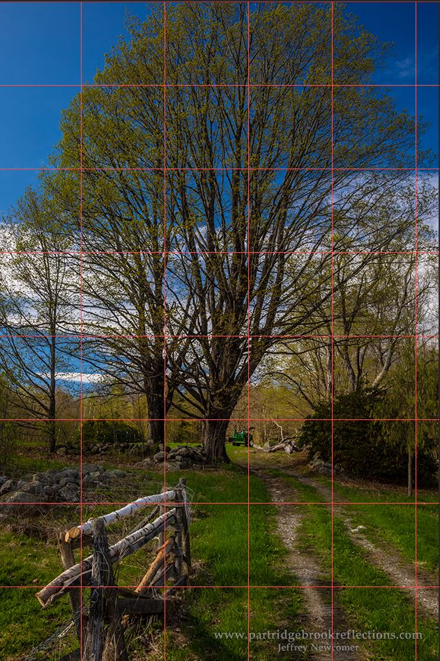
Recently, I was visiting a friend’s farm down a backroad in Chesterfield New Hampshire.  In addition to becoming reacquainted with their semi-friendly donkey, I got a nice shot looking up the pasture lane which reminded me of the power of the Content Aware Tool.  The picture had all the essentials, beautiful light, a nice fence and road all leading to the border tree and even a distant tractor.  Great! But when I got home, I realized that all of my focus stacked images were significantly rotated clockwise. I could just hear the donkey laughing, but, hey, this is digital, all I had to do was rotate the image back to plumb.  A 5.5 deg counter-clockwise rotation brought everything back to normal, but the process left me with four triangular areas of vacant space at each of the corners.


Curing the Triangular Transparencies
My choices were simple, I could either crop out the areas of transparency, use cloning to fill the spaces or do some combination of the two.  I wanted to keep most of the full image, so cloning was the obvious solution.  All of this could be achieved with careful use of the cloning brush, but it was the perfect situation to start with Content Aware Fill.


Fill Menu
I started working on a fresh pixel layer to preserve the original layer and then by selected one of the spaces.  On this picture, selection was easy to do.  On these geometric shapes, I find that the Polygonal Lasso Tool works well.  It is generally good to expand the selection slightly into the surrounding pixels.  I typically use “Modify” “Expand” adding about 5 to 15 Pixels, depending on the size of the selection.    I then pulled up the Content Aware Fill option under the Edit drop-down menu.  


Filled Triangle

The Content Aware Tool has a few options.  “Color Adaptation” should be checked to improve the color blending of the patch.  Since I was filling an area of transparency, the most important thing in this case is to leave the “Preserve Transparency” box unchecked.  Otherwise none of the area will be filled.   I hit “Ok” and waited for the magic. 
Duplicate Fence Post
 In this case the results were generally quite good requiring only a little cloning touch-ups, but the CAF tool works randomly each time and, if you don’t like the results you can always try again. 

As you review the results of the fill, it is important to look for areas where surrounding detail has been noticeably copied into the patch.  This can be seen in the upper left where a fence pole was clearly duplicated.  A little cloning easily removed the obvious defect, but sometime the duplications can be more subtle.  A careful examination is always a good idea.


Madame Sherri’s Hat
Madame Sherri at the Ball 1920s
Like most of Photoshop’s new “magic” tools CAF is not quite as magic as it is suggested in Adobe’s press releases.   CAF does not work in all situations and almost always requires some amount of clean-up to reach the best result.  An example of this can be seen in my article about repairing antique photographs.  The absent area of curtain was first filled with CAF, but the folds did not align with the rest of the material.  With the cloning brush I was able to smooth out the lines to make a more even match.  We can see that Madame Sherri really knew her hats!

Content Aware Fill - Poor Alignment

CAF and Cloned Touch-up

Parrish Shoes

The fictitious Parrish Shoes sign was painted on a wall in downtown Keene NH for the filming of the movie “Jumangi”.  Since then, the town has elected to keep, and regularly refresh, the sign as a local attraction. 


I recently shot the spot from the perspective of the shoes, but of course I couldn’t avoid at least one person waiting at the crosswalk. With the woman against the brick wall, CAF didn’t do a great job.  The brick kept bleeding into the patch.  I tried it a few times, but eventually found it easier to use the Cloning brush.


Bleeding with Content Aware Filll


That’s it.  One of the confusing things about Photoshop is that there is almost always more than one way to achieve the same result.  The challenge is to choose the right tool or tools for the situation.  As you use the CAF tool you will begin to recognize situations where it will work well and other where the surrounding detail may get blended uncomfortably with the result. In these situations, “Content Aware Patch” can provide a bit more control over the sampling area.  But that is a subject for another article and, of course, you can always go back to the good old Cloning Brush.


Jeffrey Newcomer


Sunday, July 16, 2017

Using the Lightroom Reference Tool


Adobe regularly sends out updates to their Lightroom CC.  As the Creative Clouds “drift” by, these updates are often filled with new camera support and, hopefully, performance upgrades, but occasionally they slip in a new Tool to make things interesting.  These new gizmos are usually fun to play with, but it often takes a while to figure out what practical value they offer and how they might fit into my day-to-day workflow.  This was true for the new Reference Tool.

Enter the Reference Tool
Back a few months ago, the version 2015.8 (Catchy) included the addition of the Reference Tool in the Develop Module.  We are familiar with the Compare Tool in the Library Module, that allows a side-by-side comparison of two images. The Reference Tool appears in the same location in the Develop module as the Compare button, but exchanges the “X/Y” label for an “R/A” Label, standing for Reference and Active windows

The Reference tool allows you to compare two photos, with one a “Reference” image, which stays static, and the other a comparison image which can be edited (i.e. Active).  The usual goal is to match the Active image to the tone and color balance of the Reference.  

The Reference window can most quickly be opened by clicking on the R/A button or by using the short-cut “shift R”.  It is simple to set a reference image by dragging it onto the left window of the tool.  A single image or a series can then be moved to the right window and visually adjusted to the reference.

Easy, but when should you use the tool? 
Adobe suggests:

“This is helpful when making a group of images from a single event look similar or setting the white balance appropriately in mixed lighting conditions,”

Sunrise Challenge

Gradient Neutral Density and Flair

Nifty, but, until recently, I hadn’t found any situations in which this capability was helpful for my landscape photography.  Last week I was shooting a sunset from one of my favorite spots along Route 63 in Chesterfield New Hampshire.  The clouds were a bit too dense, and the sun peeking through them created excessively high contrast.  I tried using a graduated neutral density filter without much success and as usual adding an additional layer of glass just accentuate the flair coming from the brilliant solar disk..

  I tried a few shots, but then settled down to wait until after the sun dropped below the horizon.  In the meantime I studied the long shadow of my tripod and me, reaching back to the Chesterfield Firehouse.  Then the real show began.  As the sun set, the clouds lite up nicely.  Although the sky remained quit bright, the contrasts was easier to manage.  The problem then was to try to find a foreground with enough interest to balance the brilliant sunset glow.   From my location, the lovely pasture spread out toward the distant Vermont hills.  Classic, but rather bland, especially while mired in the shadows.  


Sunset Song

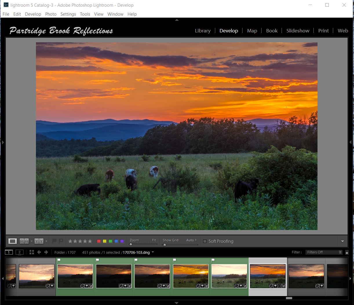
The sky was dramatic but I wanted to find something interesting to put in my foreground.  My first choice was a rather scraggly tree off to one side.  I was attracted by the flock of birds filing the branches, and ecstatically chirping at the fading gold.  It was a charming sunset sonata, but then I noticed cows grazing my way.   I had to scramble to get down to the herd’s level, but then I had my “foreground element”.   I was ready to go.   Again I tried to reduce the contrast with my Neutral density filter, but I got my best results by combining the graduated ND with a five exposure High Dynamic Range image.

Active Grazing


After processing, the sky came out beautifully and the foreground was reasonably exposed.  The problem was that the cows appeared blurred as they methodically grazed there way through the multiple exposures.

HDR Image


My Foreground Image, Exposed to the Right
Looking through the individual images, I found that all had some blurring, but some were less noticeable than in the HD image.  I decided to blend the foreground from one of the single images with the HDR sky.

To get better tonal quality and less noise, I selected my foreground picture from one of the brighter images.  Remember exposing to the right?  To make the blending easier, I wanted to darken the foreground image to closely approximate the tone and color balance of the HDR sky.  This is where the Reference Tool entered my workflow.


Reference Tool

Matched Images
I dragged my HDR image onto the reference window of the tool and then added the foreground to the comparison.  It was then a relatively easy matter to adjust the tone and color of my foreground image.  It wasn’t perfect, but after exporting it to Photoshop, the modified foreground image was close enough to easily to blend with HDR sky.  The final image showed the placid cows munching contentedly, totally oblivious to the spectacular fireworks hovering above their heads.  

Matching the Reference HDR Image, Step by Step


Final Composite Image
I could have roughly matched my two images without a dedicated side-by-side comparison, but the Reference Tool made this chore much easier and more precise.  I had to apply only a few minor adjustments to the masked foreground to reach a perfect the blend. The ability of the Reference Tool to match image layers for compositing is a great use for this new Lightroom feature, and allows me to comfortable position this new “gizmo” within my landscape workflow.

Check out more articles on Lightroom and Photoshop on my Blog at:
Photographic Editing (Photoshop & Lightroom) 

And watch here for information about my next Lightroom course, coming this winter. 
YES, winter is coming!


Jeffrey Newcomer

Monday, June 12, 2017

Lightroom to Photoshop, When to Jump?


I have just started my next Introduction to Lightroom class. With each major update, Adobe’s Lightroom keeps getting more powerful, and I love sitting around my dining room table demonstrating all the features of this remarkably capable and intuitive program.  


I have been a devoted Photoshop user for years, but for many,
Sugar Hill Lupines Remembered
Photoshop’s complexity has represented a daunting barrier to the discovery of the broad potential of the “Digital Darkroom”.   Since its initial release in 2007 Lightroom has progressed from image organization, to progressively more sophisticated editing  and outputting capabilities.  I initially came to Lightroom to help organize my 400k (now 500K) images in a more easily accessible database program, but, as I became familiar with the editing functions in the Develop Module, I stayed to do much of my global editing within the program.  I found that Lightroom’s workflow was more intuitive, it had the same functions as Photoshop’s Camera RAW and the sliders were easier to use.   So why move my images to Photoshop.


I routinely tell my students that, for many of them, and especially as they get started in image editing, Lightroom may be all they need for simple image adjustments. I probably do about 90% of my image editing in Lightroom, and the resulting images could often stand on their own, but I still routinely make the move to Photoshop before feeling that my work is truly done.  So why do I make the jump?


Complicated Selections

Lightroom allows simple localized adjustments with gradient, oval and brush tools, but Photoshop allows much more finely controlled selections which can be applied to layers affecting a full range of adjustments as well as to  image layers.  The ability to use layers is a key  strength of Photoshop and essential difference between it and Lightroom.
Focus Stack


Comparing Images


Compare Mode
Lightroom has several ways to view and compare images, most notably, the Survey and Compare options in the Library Module’s Tool Bar.  My biggest problem comes when I have several images to compare.  This most often happens when I want to find the sharpest image among a group of captures of the same scene or, when I want to select the best images from a focus stack.  The Compare Tool allows two images to be compared side-by side at varying magnifications, but it is tedious to step through a long series of similar images to find the best.  


Survey Mode, Keene Central Square
The Survey Tool allows several images to appear in an array on the work screen, but each can only be seen in full size.  This is helpful when prominent defects are apparent, but since the images can’t be zoomed together,  the survey is not useful to make precise comparisons of sharpeners and focus.  This is where Photoshop comes to the rescue.


Photoshop Arrange, Zoomed
In Photoshop several images can be arranged in various patterns, horizontally, vertically or in grids.  The images can then be zoomed together for detailed comparison.  The windows can be locked to allow synchronized movement around all the images.  Sometimes, early in the editing process,  I will move a group of images to Photoshop for this comparison and then, when I have identified the best capture, I can remove the Photoshop versions and go back to finish work on the chosen image in Lightroom.


Compositing and Text

There's always one that needs help
 Lightroom doesn’t allow the blending of different image layers.  I can’t move heads around in group portraits or add that dragon sitting on top of the lighthouse.  

I also need to jump to Photoshop to add text to my images.


Dragon on Portland Head Light


Cleaning Up

Harrisville Library Wires
Lightroom can be used to remove dust spots and other simple distractions, but, for more complex problems,  the spot removal tool does not offer the precision of Photoshops Cloning and Healing Brushes. Also the miracle of Content Aware Fill and Move, and the Puppet Move are only available in Photoshop.

 
Complex Cloning


Since I am teaching Lightroom, I enjoy pushing the limits of what can be done with the program’s limited tools.  It is remarkable how much can be accomplished, but at some point, for both ease and accuracy, I have to make the jump.  For now, when it comes to seriously “punishing the pixels” Photoshop is the only way to go


Sharing

Tulip Path, Putney VT
It is important to understand that a file in Lightroom is not a finished image.  The price of nondestructive manipulations is that the image that you see in the Lightroom‘s working panel is not real.  It is still just the RAW file with a bunch of adjustments stored in the catalog, but not actually affecting the original image file.  That is why there is no “save” command in Lightroom.  To make the Lightroom image actually “real”, available for you to save, and others to see, it must be Exported into any of a number of standard formats.  Whether it is in a PSD, TIFF, JPG, PNG other other, more exotic, formats the Lightroom adjustments are burned in and the image is no longer RAW.  


Most of the time, I make this jump by moving the image for final touch-ups to Photoshop, but the Lightroom adjustment can also be applied as the file is exported to a specific image format.


Either way, before the jump, I ask myself if I have done all I can within Lightroom. When I make the move I want to know that I am leaving a pristine RAW file in my directory and a safely separate and nondestructive set of adjustments carefully archived in my Lightroom Catalog.


Printing

OK, this is an admission of my Lightroom ignorance.  I have never been able to get the best results when I try to print from Lightroom.  All the controls seem to be there, but I remain more comfortable applying my printer profiles and adjusting the resulting soft proof from within Photoshop.


I’m always embarrassed when I reach the point in my Introduction to Lightroom Class when I have to review the Print  Module.  The Module is powerful and intuitive.  I know I’ll get it eventually, but for me fine art printing is a whole different part of the process of image making and, for now, to get it right, I still make the jump to Photoshop.  


These are just a few of the reasons why I make the jump.  I am sure that there are many more.  Sometimes, when I’m happy with the image in Lightroom, and don’t have any obvious reason to move, I will still finish my work with a final examination in Photoshop. A fresh look in the context of the expanded tools of my old friend can often suggest subtle final adjustments that can make a significant difference.