
Adobe regularly sends out updates to
their Lightroom CC. As the Creative Clouds “drift” by, these updates are
often filled with new camera support and, hopefully, performance upgrades, but
occasionally they slip in a new Tool to make things interesting. These
new gizmos are usually fun to play with, but it often takes a while to figure
out what practical value they offer and how they might fit into my day-to-day
workflow. This was true for the new Reference Tool.
Enter the Reference Tool
 Back a few months ago, the version
2015.8 (Catchy) included the addition of the Reference Tool in the Develop
Module. We are familiar with the Compare Tool in the Library Module, that
allows a side-by-side comparison of two images. The Reference Tool appears in
the same location in the Develop module as the Compare button, but exchanges
the “X/Y” label for an “R/A” Label, standing for Reference and Active windows
Back a few months ago, the version
2015.8 (Catchy) included the addition of the Reference Tool in the Develop
Module. We are familiar with the Compare Tool in the Library Module, that
allows a side-by-side comparison of two images. The Reference Tool appears in
the same location in the Develop module as the Compare button, but exchanges
the “X/Y” label for an “R/A” Label, standing for Reference and Active windows The Reference tool allows you to
compare two photos, with one a “Reference” image, which stays static, and the
other a comparison image which can be edited (i.e. Active). The usual
goal is to match the Active image to the tone and color balance of the
Reference.
The Reference tool allows you to
compare two photos, with one a “Reference” image, which stays static, and the
other a comparison image which can be edited (i.e. Active). The usual
goal is to match the Active image to the tone and color balance of the
Reference.
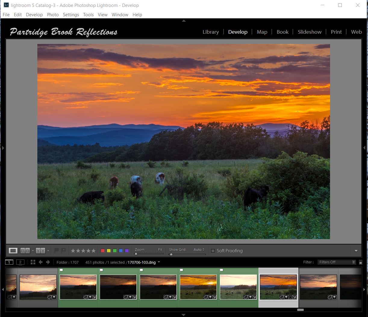
The Reference window can most
quickly be opened by clicking on the R/A button or by using the short-cut
“shift R”. It is simple to set a reference image by dragging it onto the
left window of the tool. A single image or a series can then be moved to
the right window and visually adjusted to the reference.
Easy, but when should you use the tool?
Adobe suggests:
“This is helpful when making a group
of images from a single event look similar or setting the white balance
appropriately in mixed lighting conditions,”
Sunrise Challenge
 |
| Gradient Neutral Density and Flair |
Nifty, but, until recently, I hadn’t
found any situations in which this capability was helpful for my landscape
photography. Last week I was shooting a sunset from one of my favorite
spots along Route 63 in Chesterfield New Hampshire. The clouds were a bit
too dense, and the sun peeking through them created excessively high contrast.
I tried using a graduated neutral density filter without much success and
as usual adding an additional layer of glass just accentuate the flair coming
from the brilliant solar disk..
 I tried a few shots, but then
settled down to wait until after the sun dropped below the horizon. In the meantime I studied the long shadow of my tripod and me, reaching back to the Chesterfield Firehouse. Then
the real show began. As the sun set, the clouds lite up nicely. Although the sky remained
quit bright, the contrasts was easier to manage. The problem then was to
try to find a foreground with enough interest to balance the brilliant sunset
glow. From my location, the lovely pasture spread out toward the distant
Vermont hills. Classic, but rather bland, especially while mired in the shadows.
I tried a few shots, but then
settled down to wait until after the sun dropped below the horizon. In the meantime I studied the long shadow of my tripod and me, reaching back to the Chesterfield Firehouse. Then
the real show began. As the sun set, the clouds lite up nicely. Although the sky remained
quit bright, the contrasts was easier to manage. The problem then was to
try to find a foreground with enough interest to balance the brilliant sunset
glow. From my location, the lovely pasture spread out toward the distant
Vermont hills. Classic, but rather bland, especially while mired in the shadows.
 |
| Sunset Song |
The sky was dramatic but I wanted to
find something interesting to put in my foreground. My first choice was a
rather scraggly tree off to one side. I was attracted by the flock of
birds filing the branches, and ecstatically chirping at the fading gold. It was a
charming sunset sonata, but then I noticed cows grazing my way. I
had to scramble to get down to the herd’s level, but then I had my “foreground
element”. I was ready to go. Again I tried to reduce the contrast
with my Neutral density filter, but I got my best results by combining the graduated
ND with a five exposure High Dynamic Range image.
After processing, the sky came out beautifully and the foreground was reasonably exposed. The problem was that the cows appeared blurred as they methodically grazed there way through the multiple exposures.
 |
| Active Grazing |
After processing, the sky came out beautifully and the foreground was reasonably exposed. The problem was that the cows appeared blurred as they methodically grazed there way through the multiple exposures.
 |
| HDR Image |
 |
| My Foreground Image, Exposed to the Right |
To get better tonal quality and less
noise, I selected my foreground picture from one of the brighter images.
Remember exposing to the right? To make the blending easier, I
wanted to darken the foreground image to closely approximate the tone and color
balance of the HDR sky. This is where the Reference Tool entered my
workflow.
Reference Tool
 |
| Matched Images |
 |
| Matching the Reference HDR Image, Step by Step |
|
| Final Composite Image |
Check out more articles on Lightroom and Photoshop on my Blog at:
Photographic Editing (Photoshop & Lightroom)
And watch here for information about my next Lightroom course, coming this winter.
YES, winter is coming!
Jeffrey Newcomer
Your professional knowledge about photography and utilizing the digital camera in the right way does give me a reason to learn this skill. the images are bright and by using the reference tool and compare two images.
ReplyDelete