About Me

My photo
Spofford, New Hampshire, United States
Jeff Newcomer had been a physician practicing in New Hampshire and Vermont for over 30 years. Over that time, as a member of the Conservation Commission in his home of Chesterfield New Hampshire, he has used his photography to promote the protection and appreciation of the town's wild lands. In recent years he has been transitioning his focus from medicine to photography, writing and teaching. Jeff enjoys photographing throughout New England, but has concentrated on the Monadnock Region and southern Vermont and has had a long term artistic relationship with Mount Monadnock. He is a featured artist in a number of local galleries and his work is often seen in regional print, web publications and in business installations throughout the country. For years Jeff has published a calendar celebrating the beauty of The New England country-side in all seasons. All of the proceeds from his New England Reflections Calendar have gone to support the Pulmonary Rehabilitation Program at the Cheshire Medical Center. Jeff has a strong commitment to sharing his excitement about the special beauty of our region and publishes a blog about photography in New England.
Showing posts with label Tone-mapping. Show all posts

Friday, August 22, 2014

Resurrecting Old Favorites

 Bringing New Life to Past Images


Nellie's Dread


Susan and I are getting prepared for our trip to Alaska. As always, before a big trip, our dining room table has become the staging
The Look
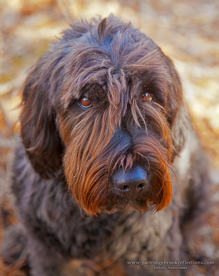
area where we pile all the stuff we don't want to forget. My job is to find all the various chargers and connectors we will need to keep our cameras and other electronics operating. Susan's task to keep me from bringing way too much clothing. Of course all this "staging" makes Nellie very nervous as she anticipates the coming separation. We have a nice house sitter lined up to keep Nell thoroughly covered in touch and love, but there is nothing like the appearance of suit cases to make her pathetically clingy.

I'm sure I'll be grabbing a picture or two on the trip and I hope to be sending out preliminary shots in my blog along the way. The status of my time and internet connectivity may be a bit shaky, so if I miss pushing out my weekly articles, I hope I will be forgiven. As I anticipate a pile of pictures to work through on my return, I thought this might be a good time to look back to some of my ancient images.

 Revisiting Old Friends

Every year there are a few images which I feel are my best, with which I have a strong personal connection. I enjoy wandering back to these old friends, but I notice that many of my former "masterpieces" don't seem to have the same brilliance and pop that I recalled. Many look unnaturally flat and dull. It's not surprising. Over 10-15 years, I would hope that my shooting and post-processing techniques have improved, and undoubtedly my personal style has evolved. Obviously, photo editing software has matured making it much easier to bring out the dramatic qualities of an image. I decided to revisit some of these old images, some dating back more than ten years, to see if, using current processing, I could breath new life into ancient pixels.

Immediately I was aware of the challenges. These old images had been captured at much lower resolution than is common now. I tried to find the least manipulated version of the images that was available. RAW files were preferable , but, for some, I had to start with a base image that already had editing baked into the file. Eight bit JPGs were especially difficult to manipulate.

Here are just a few examples of my attempts at Frankestein-like resurrections of old images. I first experimented with adjustments of color and contrast in Lightroom and Photoshop and later used blended tone mapped layers to add a broad range of pop to the images.

Portland Head Lighthouse
Some years ago, when I was more flexible, I jumped the fence at Portland Head Light to catch the surf rolling in, and nearly washing me out. This picture seemed a bit flat, without the drama that was so apparent in the moment. I worked on the image in Lightroom and Photoshop to increase the contrast and vibrance, highlighting the bright lighthouse against the dark angry sky. I also used the skew tool to reduce the keystone effect caused by my low position looking up from the rocks. The overall effect was closer to the scene that I recalled. 


Artist's Shack, Marlboro Vermont

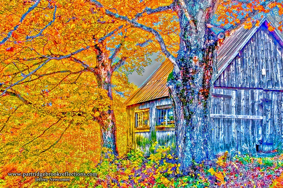
 Eight years ago I was cruising the back roads of Marlboro, Vermont looking for autumn color. I found this shack which, because of the model head in the window, I decided was an artist's studio. Probably wrong, but it gave me a title. I came back with an image that to my eye is terribly
HDR Tone
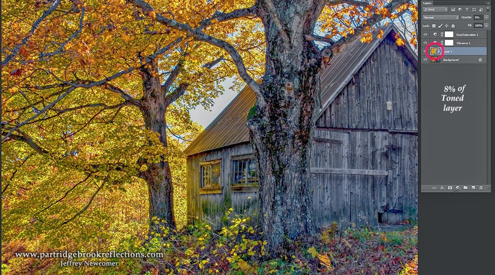
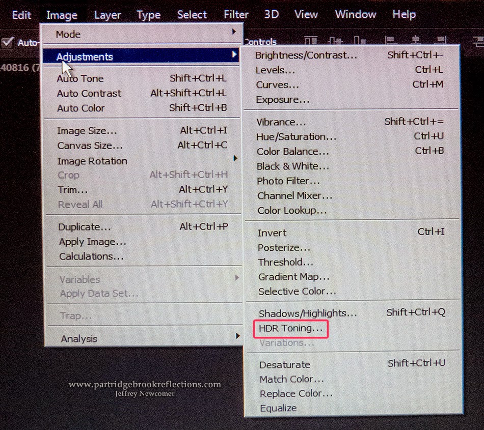
flat with none of the brilliant color that was apparent at the time. I moved the JPG into Lightroom and had some success, but then I decided to blend a toned layer to kick up the color and contrast. I have discussed this process previously. I made a flattened copy of the image and then applied "HDR Toning" in Photoshop. I have found that the "Scott5"preset is often a good starting point. The results are always grotesquely garish, but after I move this layer back to the original
Scott 5 Preset
image layer stack I drastically reduce the opacity to get just the amount of kick I want. In this case I only used an opacity of 8% to get the result I liked. It still has a touch of "painterly" quality, but I much prefer it to the original. The nice thing about blended tone maps is that adjustments in the opacity allow for a near infinite range of effect to meet anyone's taste.


Storm Over Monadnock
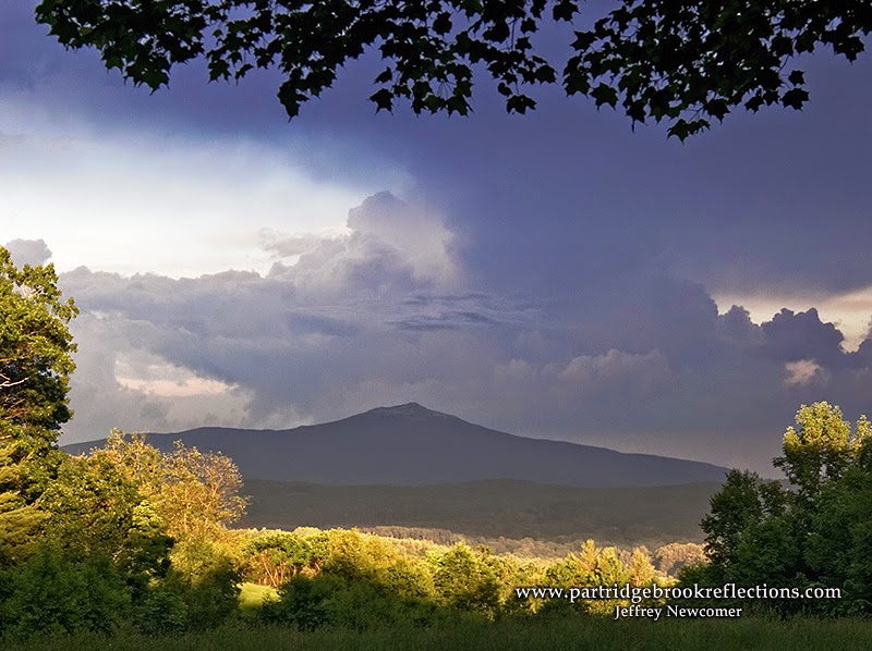
One of my favorite early images and one of my best sellers is "Storm Over Monadnock" captured in 2006 with my canon 20D.  I had watched a thunder storm pass over my office in Keene, NH and I knew it was heading for the mountain. I jumped into the car and ran for Chapman Road with its view of Monadnock to the Southeast. I was thrilled to catch the thunderhead rolling over the top of the mountain. The most dramatic part of the scene was the contrast between the ominously dark mountain and the last light skittering across the valley below. Back then I struggled with the contrast and was never fully happy with my ability to bring the light into balance. In this case I used 25% of my toned layer to bring out the contrast. I could only do so much with this aged 8 bit original, but I was happy with the results


Harvest Sunset 
The Old Oak at Alyson's Orchard is gone now having fallen to a lightning strike a few years ago. Back in 2006 it still stood proudly on the hill and I was able to capture it as part of a classic autumn scene. Once again the picture from my archives appeared flat and bit overly warm in tone. I cooled the tone slightly in Photoshop without loosing the warmth of the setting sun and then applied a touch from a toned layer to bring out the drama. 


Pemaquid Pool
Pemaquid Light
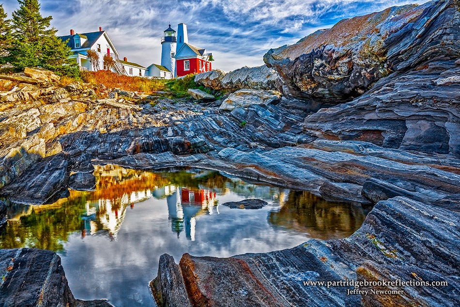
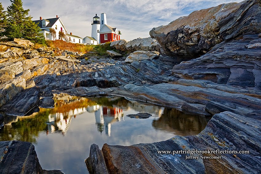
Pemaquid Light in Bristol, Maine is famous for the tidal pools that provide opportunities to catch interesting reflections. I was happy with the image that I captured of the reflected lighthouse in 2007. It has been one of my most popular coastal images, but I thought that, while I was playing with tone mapping, it might be fun to go a little crazy with this old favorite. I was also inspired by an image taken from the same spot by Rick Sammon using HDR technique. Using 28% of my toned layer I ended up with an effect beyond my usually comfort zone for HDR/Toning, but I can step back and appreciate the picture for what it is, without any pretense of real life appearance. Hey, its art. 


Well I have to get back to my packing. I've enjoyed my stroll through the past.  Photography is a time machine and it was fun to bring new life to old favorites. Now see what pictures you have that deserve to be re-imagined.


Jeffrey Newcomer
partridgebrookreflections.com


Sunday, May 19, 2013

Taming the HDR Beast

HDR ..................................................................................Blending


HDR Blending
I have never been a big fan of heavily tone-mapped HDR images, but I appreciate that it is all a matter of taste. I frequently use various post processing techniques to expand the dynamic range of my pictures, but I draw my personal line somewhat short of "cartoonish", “painterly” processing. I want my viewers to see the image as I saw the scene and, at most, ask “Did you use HDR?” and not exclaim “WOW, you really used HDR”. When using HDR programs such as Photomatix or Photoshop’s HDR Pro, I often struggle to keep the effects under control and I find that a level of tone-mapping that works well in one part of the image may be over the top in another. Increasingly I have been using image blending to manage my HDR work. The techniques are simple and provide almost infinite control over the impact of HDR and tone-mapping. 


Enhancing the Depth
Last week I got out early to catch the effect of the morning fog on the

Westmoreland Fog
early spring colors. In Westmoreland, NH, I found a nice composition with the hay wagon sitting expectantly in a pasture and the classic red barn seen on the hill above. The arrangement provided a nice sense of depth with the fog having a much stronger softening influence on the distant barn. I liked the image but I felt the effect would be stronger if I could enhance the crispness of the wagon. Enter tone-mapping. 


Given the soft light, high contrast was not an issue, so I had no need for HDR techniques to capture the full dynamic range. I didn’t capture multiple bracketed images, but I could enhance tonal contrast by applying tone-mapping to a single image. In Photoshop, I processed the image to get the best result using my standard techniques. I didn’t want to punch up the colors and contrast too much and thereby loose the soft feel of the mist, but I felt that objects in the foreground, especially the hay wagon, could benefit from crisper detail. After I was happy with the base picture, I duplicated

Tone-Mapped Crazy
and flattened the image and then opened it in Photoshop’s Tone-mapping tool. A full discussion of the use of this tool is beyond the scope of this article and also pretty much beyond the scope of my expertise. Suffice it to say that my usual approach is to

play around with the sliders until I feel I have a good result or become frustrated and chuck the whole thing. Typically I end up with something that is dramatic but beyond what I would generally feel comfortable with as a reasonably natural representation of the scene. At this point, instead of giving up in despair, I often use image blending to mute the tone-mapping effect. 


Tome-Mpped Layer at 25% Opacity & Masked


 In this case, I copied the tone mapped layer to the top of the layer stack of the original. Proper alignment was not a problem given that the two layers were from the same image. I then was able to adjust the opacity of the overlying tone mapped layer to get just the amount of enhance contrast that I wanted in the foreground elements. This global adjustment resulted in excessive contrast in the distant background, especially the misty barn. By painting with black on the mask layer I was able completely remove the tone-mapping effect from areas of the background enhancing the sense of depth in the image. 


Blended Image

Blending together a tone-mapped and regular image allows full control of the amount and location of the enhanced effects. Various levels of HDR/Tone-Mapping can be painted in by applying different levels of gray to the layer mask. White reveals all, but middle gray shows only a partial effect and because all the work occurs on the mask you can adjust and modify as much as you want. In this picture I used a single Tone-Mapped image but a bracketed, multi-image HDR layer works just as well. 


Scott Farm Rainbow

Scott Farm Rainbow

In another example I worked on an image from a wedding at the Scott Farm in Dummerston, Vermont.  The union was blessed by a beautiful
Over the Top
rainbow.  I captured the color with the farm and a classic truck in the foreground, but I thought the truck was a bit dull and flat.  At home, I created a tone-mapped version.  I typically go a bit heavy with the toning, since I know it will be muted in post.  Again, I modified the effect with opacity and then use a mask to apply it only to the tuck.  I had a great time adjusting the opacity to find the right amount of enhancement and I still may mute it a bit further.

Tone-Mapped Truck

So get out there and HDR your brains out.  Not to worry, you can always calm the craziness with a little gentle blending.


Jeffrey Newcomer
Partridgebrookreflections.com