About Me

My photo
Spofford, New Hampshire, United States
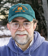
Jeff Newcomer had been a physician practicing in New Hampshire and Vermont for over 30 years. Over that time, as a member of the Conservation Commission in his home of Chesterfield New Hampshire, he has used his photography to promote the protection and appreciation of the town's wild lands. In recent years he has been transitioning his focus from medicine to photography, writing and teaching. Jeff enjoys photographing throughout New England, but has concentrated on the Monadnock Region and southern Vermont and has had a long term artistic relationship with Mount Monadnock. He is a featured artist in a number of local galleries and his work is often seen in regional print, web publications and in business installations throughout the country. For years Jeff has published a calendar celebrating the beauty of The New England country-side in all seasons. All of the proceeds from his New England Reflections Calendar have gone to support the Pulmonary Rehabilitation Program at the Cheshire Medical Center. Jeff has a strong commitment to sharing his excitement about the special beauty of our region and publishes a blog about photography in New England.
Showing posts with label composition. Show all posts

Thursday, April 18, 2019

Introduction to Digital Photography, An Overdue Course Syllabus


Upper Garwin Falls, Wilton NH

Green River Falls, Guilford Vt
I am in the middle of my Introduction to Digital Photography Class at Keene Community Education. I have been offering this 4-week course, twice a year, for several years and I continue to be amazed at what seems to be an endless supply of local people who are desperate to learn about how to use their digital cameras. The class has never failed to be fully booked immediately after the course is announced.

The program includes 8 hours of class time and two photo shoots to nearby locations. Eight hours is not enough, but during that time I try to cover a broad range of topics. In the first class, I start with a discussion of the features offered by various classes of cameras and how to approach learning the mind-boggling array of features.  I show how and where to upload and archive images and the advantages of different image file types (emphasizing RAW of course). It is a lot to pack into the first two hours.


Rockport Ma

In subsequent classes I cover the control of exposure, approaches to composition and the opportunities and challenges of shooting in various kinds of light. Somewhere in there I try to squeeze in discussions of image sharpness, focus and control of color balance.


Old Home Day, Chesterfield, NH
It is a lot to explain and in preparing my classes I have drawn heavily on the discussions I have written in many of my blog articles. My students often ask whether I have a course syllabus and I generally direct the to my blogs. Most of the information and examples are there, but it is not always easy to find. Included here is a list of links selected from over 400 blog articles that cover the key areas of my course. They are organized to roughly match the order of the classes. Hopefully these chapters will also provide a helpful introduction to the amazing world of modern digital photography for those who will never be able to participate in any of my classes.


Central Square, Keene NH
Nuts and Bolts
My first class is generally the most challenging for the students and myself as it includes such a broad range of topics. The relative advantages of large sensors and small sensors, lossy vs lossless file types, and the long list of approaches to image archiving are just a few of the topics covered.


Intro to Digital Photo Class, Spring 2018


------------------------------------------------------------------------------

Exposure

Exposure is not just about the brightness of the image. How we combine Aperture, Shutter Speed and ISO also effects important aspects of the imaging, including depth of field, portrayal of motion and image noise. 

--------------------------------------------------------------------------

Composition
Lower Purgatory Falls, Wilton NH

The “Rules of Composition” should never be allowed to restrict your own creative vision, but they can provide some helpful starting points. The rules are all based on what looked balanced and beautiful to the eye of others, and what works for your eyes has equal validity. Picasso said “We all know that Art is not truth.  Art is a lie that makes us realize truth”.  Your compositions should be a path to realizing your own personal truth.

--------------------------------------------------------------------------

Using Light

In New England, the light is always changing. Whether it is the warm beauty of the “Golden Hour” or the harsh brilliance of the midday sun, it is important to recognize the conditions, and plan your shooting to respond to the challenges and the opportunities that they provide.


--------------------------------------------------
Sharpness and Focus

The apparent sharpness of and image is not only related to proper focus, but also the steadiness of the camera. These are important topics, but I never know where I will be able to slip them into my presentations. It usually depends on how many questions I must answer and how many images I end up critiquing. 

--------------------------------------------------------------------------

Final Thoughts


Here are some of my random thoughts about art, photography and the state of digital photography’s place in the world of fine art and media. It is the kind of “artsy” talk I pledged to never use when I started my blog more than 10 years ago.


Jeffrey Newcomer
www.partridgebrookreflections.com

Sunday, November 19, 2017

Negative Space in Photography, The Power of Nothingness


Negative space is the area around the key element(s) of an image. When used effectively it can complement and draw attention to the subject of the composition, which is often referred to a “Positive Space”.  


Eagle's Watch


Negative space has applications throughout many genre of art, painting, sculpture, even music, and of course photography.  It is the process of highlighting the subject of a piece by surrounding it with areas that are of less visual interest.


Sometimes, this includes areas that are essentially blank, but it may also be regions that show softer focus or lower contrast, anything with less visual interest that might draw the eye from the primary subject of the piece.  


All too often I tend to pack my images, corner to corner, with as much detail as possible.  I paid good money for all those pixels, why not jam them with as much information as possible?  But it is a healthy exercise to look for compositions in which negative space can strengthen the message of the image. 


Nose Space

Pavlov Island, Alaska

My most frequent use of negative space is when I add nose or motion room.  

Nose room is the amount of open space left in the direction of a subject’s gaze, or direction of motion.  Flowers, trees and other inanimate elements may still have a sense of direction that can also be enhanced with negative space.


Corn Gazing Left

Flower Gazing Left


Rule of Thirds

Negative space may also strengthen a subject and draw the eye by surrounding it with areas of lower interest or it can allow the positive space to be moved away from the “dead” center of the frame to a visually stronger location, such as at the intersection of the lines of the rule of thirds.


Not Purely Negative Space, but It all works to draw the eye and tell the story


Frigate Silhouette, Galapagos Islands

There are many uses for negative space, and the best way to understand the power of nothingness is to study a few examples and then look for opportunities in your own shooting.  The important thing is to understand that your frame does not need to be filled with detail, corner to corner.  Visual impact can be enhanced by simplifying with a little negative space.


Jeffrey Newcomer
www.partridgebrookreflections.com


Sunday, September 6, 2015

Photographic Composition Tips


This week I want to briefly list a few important elements of 
composition for photographers. I am working to assemble the slides for my upcoming Basics of Digital Photography course and now that I have completed the composition section, it seems like a good time to review some of the key points with my blog audience. It will also serve as a quick on-line reference for my students who have dozed off during my droning presentation. I have covered much of this material over the years in various blog articles, but it is a valuable exercise to discuss a few of the "rules" of composition which I have found most helpful.


1) Let Your Eye be Your Guide:

Every "rule" of composition gains its validity from the fact that people have decided that the application of the rule seems to result in a pleasing and balanced image. The Rule of Thirds, the Golden Rectangle, the Golden Spiral, all have varying degrees of expert and mathematical support, but it all comes down to how the picture looks and, most importantly how it looks to you. If your image seems to work for your eye, if it is balanced and communicates what you intend, then it is a success.  So:

Screw the "Rules"!!
Now let me list some of my rules. 


2) Keep it Simple:

A Paragraph
Years ago, during a session at what is now Maine Media Workshops in Rockport Maine, Vermont photographer, David Middleton made a point about keeping the stories in your images simple. "You should be able to describe your photographs in a sentence and not require a paragraph".  It is easy to try to communicate too much in a single image. Describe the content of each picture and if you can't do it in a simple sentence (no run-ons!) then it's time to focus in on your topic. It may mean adjusting your composition or using light to direct attention. Tighter cropping or just stepping closer can be effective at removing extraneous detail. This is a constant struggle for me. It is a strong temptation to try to get everything in a single frame, but when I get home, I always seem to gravitate toward that simple sentence.
A Sentence


3) Let's Get One Thing Straight:
 
Some of the most important rules are the simplest and should be the easiest to follow. It just drives me nuts to see beautifully captured images with wonderful color, sharpness and composition, but  with just one fatal flaw. When I look at the horizon I feel like I'm about to fall over. Nothing speaks as much of carelessness and a lack of respect for the image as a horizon line which is not straight. On occasion a tilted view can be intentionally employed for artistic effect, but come on! Most of the time it is just sloppy. In the field it is easy to get the line close to horizontal and in post there are various tools to rotate or crop the image. Both Lightroom and Photoshop allow you to run a ruler along the horizon and then let the program do the necessary correction. DO IT, and do it EVERY time. Then you won't have to explain why the ocean isn't cascading off the edge of you picture. 


4) Drawing the Eye
Rule of Thirds
 

There are various techniques to draw the viewer's eye along a path to the desired point(s) of emphasis in an image. Compositional guides such as the Rule of Thirds can suggest locations within the frame which through long experience seem to be natural spots of rest for key elements of an image. 


Too ManyGuides


Psycho-perceptual studies have tried and failed to explain why these locations seem to be more visually comfortable. Some are based on experience and others, such as the "Golden Spiral", are derived from complicated mathematical formulas, but they all seem to come down to two essential dictums:

1) Keep the focus of the image away from the center, both horizontally and vertically.

2) If that doesn't feel right, move the focus someplace else. Your eye is the absolute final arbiter. There are so many guides that it is difficult to find a part of your image that isn't close to one or more of them.
 
Other tools for drawing the eye include leading lines and diagonals, which can dictate the path the viewer will follow as he explores the image. An image with prominent diagonals generally appear stronger and more active. Selective focus, lighting and color can be used to highlight an important part of the image and all of these factors can be captured in the field and enhanced in post-processing.


Diagonal Strength

Rule of Thirds, Leading Lines
and a highlighted focus point.


Images with a strong focus of interest can be created with the combination of a number of these focusing techniques. A key part of shooting is to arrange the view to help the viewer see what you see and want to share.


5) It's Good to Be Odd
 
For some reason odd numbers of items in an image appear stronger. One is better than two, three is better than two or four. It just is. One is peaceful and focused. Two leaves you wondering which to look at and three, well that's just a menage. As we get much above four and five the relationship begins to be less obvious, but it is probably still there. I would like to show you many examples of weak images of two flowers, but in searching, I discovered that I seem to have intuitively avoided pairs of anything. About the only set of two that I seem to like are my children.


6) Cropping : Less is More


Galapagos Dawn
It is painfully common practice. Folks take a picture with a camera or more often a cell phone of a dramatic sunset, an adorable little deer, or the ham sandwich they had for lunch, and immediately dump the image on Facebook. The subject may be wonderful, but I find myself screaming at the screen, "Why didn't you crop out all that plate and crumbs around your admittedly lovely feast!" I know, you paid for every pixel of that image and you will be damned if you are willing to


 throw any of it away, but most often less IS more.  I do my best to frame every image to perfection, but the fact is that the constraints of the usual viewfinder ratio of 3:4 seldom matches the best framing for the image. Rarely I will bring an image up on my screen and, as I reach for the crop tool, I have the awkward sense that the cropping is perfect as captured. It is a strange feeling and I don''t trust it.
Cropping is done for a number reasons, mostly to remove extraneous material and enhance the composition. It is usually a matter of simplifying the image and adjusting the composition to remove distractions and strengthen the focus on the subject. Cropping is also done to size the image to fit the desired digital or print output, but this step is best applied at the end of the editing process and after the full image has been safely archived. I always save an untouched version of an image before I do even the most necessary cropping.


It is always painful to discard portions of an image. Every cut reduces the resolution, but that is why sensors were created with ridiculous numbers of pixels.


7) Head and Nose Room
 
Whether it's a bird in flight or a child directing a longing glance toward a table of desserts, it is important to provide space in the direction of the movement or view. Occasionally this rule can be broken to create a sense of tension, but the frame of an image is a physical limit and it is usually uncomfortable to crash your subjects against that wall. This rule combines well with the Rule of Thirds. As you move your subject away from the
Grizzly Alaska
DEAD Center be sure that it is looking or moving toward the open space. Similarly it is important to leave adequate head room above a subject. Rarely, in a dramatic close-up, it can be effective to cut off the top of a head, but if the top is visible it is generally better to leave a little breathing room. Although most applicable to portraits, nose and head room can also be important in landscape studies.

Sometimes Breaking the Rules Can Work and is Deserved


8) Eliminating Distractions

Distractions come in all forms, a branch peaking in on the side of the frame, a bright spot of sunlight illuminating an otherwise placidly shadowed forest floor or a pack of cigarettes discarded on the lawn. It can be anything that diverts the viewer's eye from the subject, but, for we landscape photographers, more than anything, it means those God Damn Wires! 


Harrisville Tower
The best approach to distractions is to avoid them in the first place. It takes discipline to scan your viewfinder for intrusions especially those around the edges away from the focus of interest. Often a step or two to one side or the other is enough, but too often there is no way to escape the problem without
A Few Steps Closer
surrendering the best angle on the shot. That is where Photoshop comes to the rescue. Small flaws such as that cigarette pack are easy to clone away, but wires are the most bothersome example of more extensive scars that can slash across large and important parts of an image. Their removal is often arduous and time consuming and the question always has to ask, "Is this really worth it?". 


Harrisville Library Wires


I usually begin by trying to convince myself that the wires aren't really that much of a distraction, but more often, as I study the image, the scars become increasingly apparent and I eventual surrender to the need to clone. Improvements in Photoshop's Cloning and Healing brushes have made this process easier and more precise, but it still takes a persistent dedication to the perfection of the image and the message.


Wires Cloned


Still  a Little Work Needed on the Reflections

Occasionally a slight shift in position may not totally remove the wire, but it may move the problem to a area of the image where it becomes easier to clone. In the picture of the old Spofford Fire Station, the wires went across the building making precise cloning difficult, but by moving a few steps closer I was able to shift them over the sky which greatly simplified the process. Getting closer to the building did increase the key-stone distortion, but this was corrected with a perspective adjustment in Photoshop.

Old Spofford Fire Station

The secret to dealing with distractions is first to notice them, preferably in the field. The sooner those miserable scars are detected the easier they will be to avoid or remove.
Small Things Can Distract


I'll finish with a return to my first rule. The success of your images will be judged by human eyes and your eyes are as good as anyone's. It is true that your view of your image is biased by the fact that you already know what you are trying to say. It takes practice and care to communicate that same understanding to others, but the first step is to make the image work for you. When an image works it is likely that you will notice in retrospect that it complies with one or several of the guides for good composition, but the best guide is still your own eyes.

Unless you suck at composition - If so, reread the stuff above, or better, take my course!


Jeffrey Newcomer
Partridgebrookreflections.com