About Me

My photo
Spofford, New Hampshire, United States
Jeff Newcomer had been a physician practicing in New Hampshire and Vermont for over 30 years. Over that time, as a member of the Conservation Commission in his home of Chesterfield New Hampshire, he has used his photography to promote the protection and appreciation of the town's wild lands. In recent years he has been transitioning his focus from medicine to photography, writing and teaching. Jeff enjoys photographing throughout New England, but has concentrated on the Monadnock Region and southern Vermont and has had a long term artistic relationship with Mount Monadnock. He is a featured artist in a number of local galleries and his work is often seen in regional print, web publications and in business installations throughout the country. For years Jeff has published a calendar celebrating the beauty of The New England country-side in all seasons. All of the proceeds from his New England Reflections Calendar have gone to support the Pulmonary Rehabilitation Program at the Cheshire Medical Center. Jeff has a strong commitment to sharing his excitement about the special beauty of our region and publishes a blog about photography in New England.
Showing posts with label cropping. Show all posts

Sunday, September 6, 2015

Photographic Composition Tips


This week I want to briefly list a few important elements of 
composition for photographers. I am working to assemble the slides for my upcoming Basics of Digital Photography course and now that I have completed the composition section, it seems like a good time to review some of the key points with my blog audience. It will also serve as a quick on-line reference for my students who have dozed off during my droning presentation. I have covered much of this material over the years in various blog articles, but it is a valuable exercise to discuss a few of the "rules" of composition which I have found most helpful.


1) Let Your Eye be Your Guide:

Every "rule" of composition gains its validity from the fact that people have decided that the application of the rule seems to result in a pleasing and balanced image. The Rule of Thirds, the Golden Rectangle, the Golden Spiral, all have varying degrees of expert and mathematical support, but it all comes down to how the picture looks and, most importantly how it looks to you. If your image seems to work for your eye, if it is balanced and communicates what you intend, then it is a success.  So:

Screw the "Rules"!!
Now let me list some of my rules. 


2) Keep it Simple:

A Paragraph
Years ago, during a session at what is now Maine Media Workshops in Rockport Maine, Vermont photographer, David Middleton made a point about keeping the stories in your images simple. "You should be able to describe your photographs in a sentence and not require a paragraph".  It is easy to try to communicate too much in a single image. Describe the content of each picture and if you can't do it in a simple sentence (no run-ons!) then it's time to focus in on your topic. It may mean adjusting your composition or using light to direct attention. Tighter cropping or just stepping closer can be effective at removing extraneous detail. This is a constant struggle for me. It is a strong temptation to try to get everything in a single frame, but when I get home, I always seem to gravitate toward that simple sentence.
A Sentence


3) Let's Get One Thing Straight:
 
Some of the most important rules are the simplest and should be the easiest to follow. It just drives me nuts to see beautifully captured images with wonderful color, sharpness and composition, but  with just one fatal flaw. When I look at the horizon I feel like I'm about to fall over. Nothing speaks as much of carelessness and a lack of respect for the image as a horizon line which is not straight. On occasion a tilted view can be intentionally employed for artistic effect, but come on! Most of the time it is just sloppy. In the field it is easy to get the line close to horizontal and in post there are various tools to rotate or crop the image. Both Lightroom and Photoshop allow you to run a ruler along the horizon and then let the program do the necessary correction. DO IT, and do it EVERY time. Then you won't have to explain why the ocean isn't cascading off the edge of you picture. 


4) Drawing the Eye
Rule of Thirds
 

There are various techniques to draw the viewer's eye along a path to the desired point(s) of emphasis in an image. Compositional guides such as the Rule of Thirds can suggest locations within the frame which through long experience seem to be natural spots of rest for key elements of an image. 


Too ManyGuides


Psycho-perceptual studies have tried and failed to explain why these locations seem to be more visually comfortable. Some are based on experience and others, such as the "Golden Spiral", are derived from complicated mathematical formulas, but they all seem to come down to two essential dictums:

1) Keep the focus of the image away from the center, both horizontally and vertically.

2) If that doesn't feel right, move the focus someplace else. Your eye is the absolute final arbiter. There are so many guides that it is difficult to find a part of your image that isn't close to one or more of them.
 
Other tools for drawing the eye include leading lines and diagonals, which can dictate the path the viewer will follow as he explores the image. An image with prominent diagonals generally appear stronger and more active. Selective focus, lighting and color can be used to highlight an important part of the image and all of these factors can be captured in the field and enhanced in post-processing.


Diagonal Strength

Rule of Thirds, Leading Lines
and a highlighted focus point.


Images with a strong focus of interest can be created with the combination of a number of these focusing techniques. A key part of shooting is to arrange the view to help the viewer see what you see and want to share.


5) It's Good to Be Odd
 
For some reason odd numbers of items in an image appear stronger. One is better than two, three is better than two or four. It just is. One is peaceful and focused. Two leaves you wondering which to look at and three, well that's just a menage. As we get much above four and five the relationship begins to be less obvious, but it is probably still there. I would like to show you many examples of weak images of two flowers, but in searching, I discovered that I seem to have intuitively avoided pairs of anything. About the only set of two that I seem to like are my children.


6) Cropping : Less is More


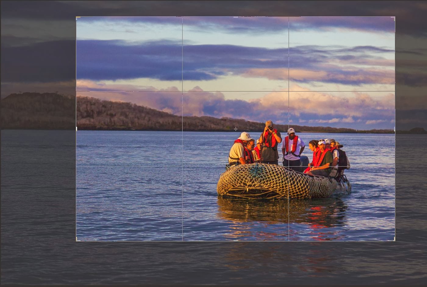
Galapagos Dawn
It is painfully common practice. Folks take a picture with a camera or more often a cell phone of a dramatic sunset, an adorable little deer, or the ham sandwich they had for lunch, and immediately dump the image on Facebook. The subject may be wonderful, but I find myself screaming at the screen, "Why didn't you crop out all that plate and crumbs around your admittedly lovely feast!" I know, you paid for every pixel of that image and you will be damned if you are willing to


 throw any of it away, but most often less IS more.  I do my best to frame every image to perfection, but the fact is that the constraints of the usual viewfinder ratio of 3:4 seldom matches the best framing for the image. Rarely I will bring an image up on my screen and, as I reach for the crop tool, I have the awkward sense that the cropping is perfect as captured. It is a strange feeling and I don''t trust it.
Cropping is done for a number reasons, mostly to remove extraneous material and enhance the composition. It is usually a matter of simplifying the image and adjusting the composition to remove distractions and strengthen the focus on the subject. Cropping is also done to size the image to fit the desired digital or print output, but this step is best applied at the end of the editing process and after the full image has been safely archived. I always save an untouched version of an image before I do even the most necessary cropping.


It is always painful to discard portions of an image. Every cut reduces the resolution, but that is why sensors were created with ridiculous numbers of pixels.


7) Head and Nose Room
 
Whether it's a bird in flight or a child directing a longing glance toward a table of desserts, it is important to provide space in the direction of the movement or view. Occasionally this rule can be broken to create a sense of tension, but the frame of an image is a physical limit and it is usually uncomfortable to crash your subjects against that wall. This rule combines well with the Rule of Thirds. As you move your subject away from the
Grizzly Alaska
DEAD Center be sure that it is looking or moving toward the open space. Similarly it is important to leave adequate head room above a subject. Rarely, in a dramatic close-up, it can be effective to cut off the top of a head, but if the top is visible it is generally better to leave a little breathing room. Although most applicable to portraits, nose and head room can also be important in landscape studies.

Sometimes Breaking the Rules Can Work and is Deserved


8) Eliminating Distractions

Distractions come in all forms, a branch peaking in on the side of the frame, a bright spot of sunlight illuminating an otherwise placidly shadowed forest floor or a pack of cigarettes discarded on the lawn. It can be anything that diverts the viewer's eye from the subject, but, for we landscape photographers, more than anything, it means those God Damn Wires! 


Harrisville Tower
The best approach to distractions is to avoid them in the first place. It takes discipline to scan your viewfinder for intrusions especially those around the edges away from the focus of interest. Often a step or two to one side or the other is enough, but too often there is no way to escape the problem without
A Few Steps Closer
surrendering the best angle on the shot. That is where Photoshop comes to the rescue. Small flaws such as that cigarette pack are easy to clone away, but wires are the most bothersome example of more extensive scars that can slash across large and important parts of an image. Their removal is often arduous and time consuming and the question always has to ask, "Is this really worth it?". 


Harrisville Library Wires


I usually begin by trying to convince myself that the wires aren't really that much of a distraction, but more often, as I study the image, the scars become increasingly apparent and I eventual surrender to the need to clone. Improvements in Photoshop's Cloning and Healing brushes have made this process easier and more precise, but it still takes a persistent dedication to the perfection of the image and the message.


Wires Cloned


Still  a Little Work Needed on the Reflections

Occasionally a slight shift in position may not totally remove the wire, but it may move the problem to a area of the image where it becomes easier to clone. In the picture of the old Spofford Fire Station, the wires went across the building making precise cloning difficult, but by moving a few steps closer I was able to shift them over the sky which greatly simplified the process. Getting closer to the building did increase the key-stone distortion, but this was corrected with a perspective adjustment in Photoshop.

Old Spofford Fire Station

The secret to dealing with distractions is first to notice them, preferably in the field. The sooner those miserable scars are detected the easier they will be to avoid or remove.
Small Things Can Distract


I'll finish with a return to my first rule. The success of your images will be judged by human eyes and your eyes are as good as anyone's. It is true that your view of your image is biased by the fact that you already know what you are trying to say. It takes practice and care to communicate that same understanding to others, but the first step is to make the image work for you. When an image works it is likely that you will notice in retrospect that it complies with one or several of the guides for good composition, but the best guide is still your own eyes.

Unless you suck at composition - If so, reread the stuff above, or better, take my course!


Jeffrey Newcomer
Partridgebrookreflections.com

Sunday, January 26, 2014

Cropping, In Photography, Less is Often More


A Few Thoughts on Cropping
One of the most important attributes that separates a fine art image from a snap shot is its composition. A photograph of even a
mediocre setting can achieve a level of strength and immediacy when composed with balance and a flow which draws the eye to the subject without distraction or clutter. There are many compositional rules can be of help in arranging a powerful composition, including the rule of thirds, use of diagonals and head room, but one of the simplest and most effective methods to add power and focus to an image is with cropping. Cropping may be performed in the camera or in post-processing.  I tend to crop aggressively, but there are a few considerations to keep in mind about the benefits and risks of the cut and slashing.  An important concern is to avoid cutting too far.


In Camera

One of the most obvious signs of a snap-shot is when the subject is

Move in and Arrange Head Room
only a small portion of the image, usually dead center and surrounded by distracting and superfluous material. It is often helpful to start with a broad image which establishes the location, but from then on the mantra should be "move in, move in". Whether you move in with your feet or with your zoom lens the goal is to fill the image with your subject. As you zoom what you are actually doing is cropping out extraneous stuff that only distracts from the focus of the image. 

Audrey's Trail


 The primary advantage of cropping and composing within the camera is that you are using all the pixels available on your sensor
and getting the maximal resolution for your subject, but it is important to remember that the "subject" is seldom just the "subject'. The "subject" of an image of a beautiful tree may include a stream, rolling hills or perhaps a mountain in the background all arranged to complement and draw the eye to the stately Maple. The art comes from recognizing how your subject best fits within its surroundings and to avoid moving in so close as to eliminate important framing elements. It is appropriate to emphasize the advantages of zooming in, but it is also important to remember that the camera frame places restrictions on the picture's proportions that may limit options during the fine tuning of the composition in post-processing. 


The Tyranny of the Viewfinder

The camera viewfinder and sensor imposes a fixed frame around your composition. As you move in you can explore various
arrangements of the important elements within that rectangle, but the problem comes when the best composition doesn’t match the dimensions of the frame. Although precise sizes are quite variable, most digital sensors are about half again as wide as they are tall, that is, most hover around an aspect ratio of 3:2 or 4:3. Specific dimensions vary, but the standard full size digital sensor is 37x24 mm or at a ratio of 3:2 (1.5). Nikon’s APS-H sensor can be 28.7x19mm (1.5), Canon’sAPS-C sensor is 23.6 x 15.7 (~1.6), and the smaller Micro 4/3rds sensors are 17.3x13 (1.33). Tightly composing within my full frame camera works well if the final image is intended to conform to a 3x2 aspect ratio. It will fit perfectly in a 12 x 18" or 4" x 6" print, but an 8" x 10" print has a ratio of 1.25 meaning that at least 17% of the pixels will need to be cropped away from one or both of the sides of the image to fit a landscape oriented 8x10 print. Important parts of the image may be lost if the composition is too tightly framed in the camera. The point is that overly aggressive cropping in the camera can limit final composition options when the image is adjusted in post-processing to fit specific output dimensions. 


It is great to move in to your subject to get the best use of your expensive pixels, but today's camera’s have resolution to spare and we can afford to allow a little buffer to assure that everything of importance will be preserved after the final crop. By all means, crop in the camera, but do it carefully and with an eye toward the options for the final composition. 


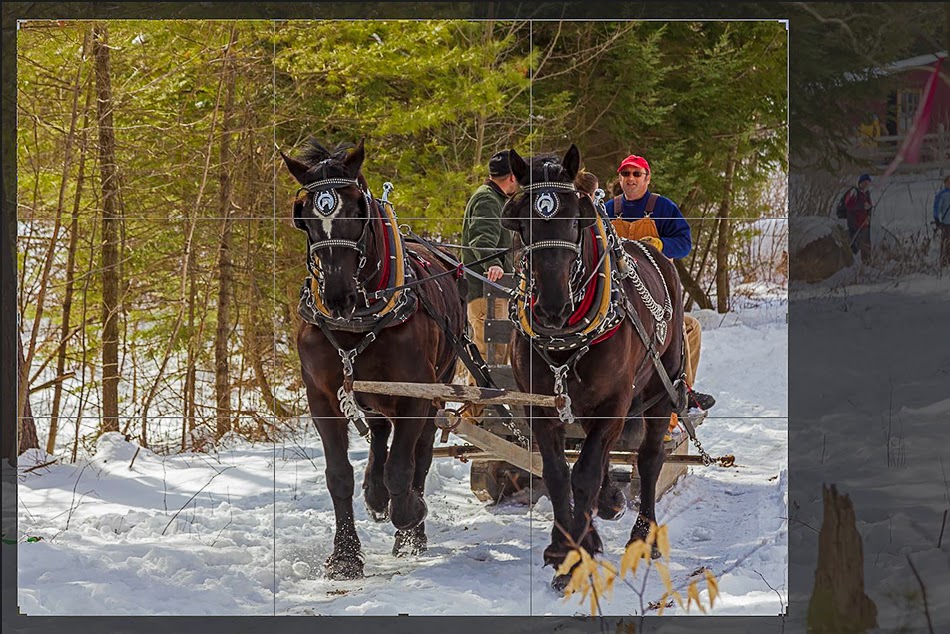
Photoshop can add a Rule of Thirds grid while Cropping
Post-Processing Crop
The capability to crop an image is basic in any photo editing software. As is true in the camera, post-processing cropping is done to fine tune the composition and to eliminate distracting elements along the borders.  It is also used to resize the picture for particular output dimensions. It is unusual to find a raw image that can't be strengthened by careful cropping, but before discussing post-processing cropping, I must mention one important basic rule.  Again it has to do with preserving your options.

Galapagos Islands, Ecuador


Before All Else, Do No Harm

Before I start cutting and slashing, I always save a full size version
Rethinking the camera Crop
of the image. Sizing, sharpening and cropping are usually the last things I do when editing an image. They are done to specifically tailor the image for its intended output, whether it is for a 12x16 print, a massive poster or a small web image. I do as much editing on the full size image as possible and then save that file as my baseline source from which all other images are derived. Since any editing that I perform after resizing will need to be repeated on all other output versions, saving a full size, edited version can save a lot of time. Actually, before I reach the point of cropping, sharpening and sizing, I save two versions of my full size image, one as the original raw file directly from the camera and the second including all my basic edits in DNG format. 


Cut and Slash,
Why Do We Crop?
Stated most simply, cropping is the process of controlling what the viewer will see and just as importantly, what he won't see.


Improving Composition
Probably the most important reason to crop an image is to arrange the elements within the frame to highlight and draw attention to the subject. This includes positioning the subject within the frame. Guides such as the Rule of Thirds can help, but often the best guide is your own eye. The use of diagonals and other leading lines can draw the eye to the subject and their strength can be enhance by how they relate to the frame. Cropping can adjust for proper headroom for the subject and move horizon lines away from dead center. At the same time elements which pull the eye away from the subject can be eliminated. 


Removing Edge Distractions

A basic step in editing an image is to scan the edges of the frame
Newfane Courthouse, Clonning Needed
for distractions. Distractions can include a stray rocks or tree branch, but may merely be a splash of unusual light or dark which pulls the eye. Cropping can often removes these peripheral blemishes, but when the cropping required affects the overall balance of the composition cloning may be a better solution. Finding distractions can often be complicated by our own focus on the detail of what we know to be the main subject. Before I finish editing, I will often sit back and squint to blur the image detail. It is surprising how often distractions can be revealed when the image is reduce to abstract patterns of color and light. 


Sizing

Final cropping is usually designed to size the image for the
Not all leading lines are straight
specific output requirements. This often includes adjustments to fit a printed version or web sizing. Changes in image size and resolution can affect sharpness. A final sharpening may be needed before the image is ready to be released to the world.

Cropping is perhaps the most basic tool for creating powerful compositions. It can be painful to cut away our precious pixels, but, in photography, it is important to understand that less is often very much more.


Sunday, February 17, 2013

Photographic Composition, Avoiding Distractions


This weeks article may be a bit short. Susan had bilateral knee
White Hillside, Pomfret, Vermont
replacement a little over a week ago and I have been spending most of my time playing the role of supportive husband and therapist. She is doing remarkably well, but two replacements at the same time requires a lot of recovery and assistance Our wonderful daughter Abigail came up, from Washington to help out, allowing me to go to work for a couple of days, but now I am back on full duty. I won't be getting out of the house much in the next several weeks. All of this to explain why this week's blog is uncharacteristically brief and to the point. 


Hillside Distractions


Last week I discussed a few compositional techniques to help draw the eye to the key elements(s) of your photographs. Strong compositions typically provide a comfortable visual path to the subject. It is an essential part of an image's ability to tell a coherent story and story telling is what photography, at it's best, should be about.


Drawing the eye is effective, but avoiding distraction from the main
Damn Wires, Harrisville, NH
subject can be equally important. As I try to arrange a composition, I also watch for elements in the image that might distract from the central theme. Areas of bright light or color, competing lines or incongruous stuff poking in along the edges can disrupt the balance and flow of the image. 


Worth the effort


In the Camera
Avoiding distractions starts in the camera. As I approach the critical moment of shutter release I always try to pause for a quick scan of the composition for competing elements. The problems may be obvious, but often it takes discipline to shift the eye from the magnetic attraction of the subject to the surroundings. I first check the background and foreground for distractions. With portraits, it is usually the tree growing out of someone 's head, but phone wires, signs, or splashes of spectral light are just a few of the common problems. My final step is to scan the edges of the image for intrusions. Often subtle changes in framing can illuminate most problems, but sometimes the best composition unavoidably includes distractions. Thank goodness for the cloning tool.  But before you become outraged about post-processing solutions, please indulge
 my standard sermon.


Greening, Spring Hillside, Dummerston, Vt
Just a simple post


The Sermon, When in Doubt, Run to Ansel
There are those who will cheer efforts to frame images in the camera to eliminate distractions, but will protest their removal in post-processing as a dishonest manipulation of the reality of the scene. To me these questions of photographic purity are always a matter of individual artistic expression. My view is that photography is much more than a slavish regurgitation of the data recorded by the sensor. At its best a photographic image has the capacity to preserve not only what the eye sees, but also what the brain perceives and our memory retains. When I behold a beautiful landscape, I see the beauty and not the scars and it is that untarnished beauty that lasts in my memory. At home, when I see the RAW images, I am often surprised by what I didn't "see" while on site. I don't remember those cigarette packages on the ground or those hideous telephone wires and I don't feel any responsibility to preserve them to prove that I am a photographic purist. Angel Adams was once criticized for touching up a negative to remove graffiti that had been painted on rocks in one of his timeless images of Mt Whitney and the Alabama Hills. In response he said, " I have been criticized by some for doing this, but am not enough of a purist to perpetuate the scar and thereby destroy – for me at least – the extraordinary beauty and perfection of the scene" (from  The 40 Images). But I digress, as usual.


But Become Clear Once Removed
Pomfret Vermont
Often the Distractions are Small ....


Thank God and Ansel for the Cloning Tool
The first step in post-processing is to identify the issues. Cropping 


Die Annoying Bipeds!
and cloning can illuminate many distractions and sometimes the problems can be minimized by reduction in brightness or saturation, or by softening with the use of localized blurring. The art is in choosing the right tool and making the changes subtle. Cloning technique could be the topic of a number of articles by itself, but the secret is to vary the cloning sources and brush hardness to avoid excessively soft regions or obvious repeating patterns, and blending cloned areas with the background. It is always best to make these changes on a blank layer or a copy to avoid irreversible damage to the parent image.


Peggy's Cove Light, Nova Scotia


 One quick tip is to do the cloning early in your processing and especially before the image is re-sized. You don't want to be forced to re-clone every time a different size is required. Proper cloning can be a painstaking and time consuming job, but the results are usual well worth the effort. Besides, there is a perverse God-like pleasure in erasing those annoying humans from your beautiful image. 


Distracting White Label
Dummerston Vt, Hot House Flower


I promised this would be quick. Beyond the preaching, my point is really quite simple. Deciding on the path through your image you want your viewers to follow , arranging the elements to draw the eye along that path, and avoiding intrusions that may distract from the journey, are essential steps to a strong composition which tells your story.

Now back to the gimp.