 |
| "Going Crazy" at Cathedral of the Pines |
 |
I was reminded about all this a couple of weeks ago when I received a inquiry from a designer who was interested in using one of my images on a "gourmet" doggy treat package. I have FINALLY arrived! I was surprised when I learned that the picture he had selected was one of just a few on which I had experimented with what I feel is rather garishly heavy HDR rendering. The picture was a multi-image capture of a farm connected to the beautiful and inspiring Cathedral of the Pines in Rindge New Hampshire. It was fun to "go crazy" with this, but It is not the way I normally choose to reflect what I see and, as a result, I was unprepared to have it attract this attention. I'm not sure whether I will actually make it to the doggy bag, but, my sensibilities aside, I will certainly be happy to license the image.
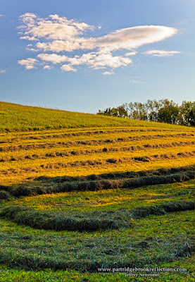
HDR simply refers to a variety of techniques which are are available to capture the full range of brightness and I feel that this is sometimes better accomplished with manipulations in Photoshop that don't involve bracketed images or dedicated software. There are situation in which I am quite happy to use HDR software such as Photomatrix. Last week, while scouting sites in Peterborough NH for the upcoming Sharon Arts "Paint-Out", I came a cross a nice field of new mowed hay glowing in the evening light. The contrast between sun and shadow was daunting, but three images in Photomatrix did a impressive job balancing the light.  Because the images were taken in a burst there was essentially no movement in the trees or clouds to cause ghosting. All I had to do was blend out a bit of banding in the clouds. In the right situation HDR software can be magical and so, when faced with a high contrast subject, I will often take a series of exposures with the thought that I may go into Photomatrix to gently massage out the full dynamic range. The results are usually striking at first glance, but on closer inspection I often start seeing problems that become significant if the images is to be taken beyond a small on-line picture. Coarse grain, ghosting of moving elements, chromatic aberration and loss of sharpness become particularly troublesome when I try to print large images for display or sale. I frequently end up returning to Photoshop to either manually blend a couple of the images or use the software's powerful tools to tame the broad contrast. This inevitably takes considerably more time, but in the end I am usually much happier with the results.
 Because the images were taken in a burst there was essentially no movement in the trees or clouds to cause ghosting. All I had to do was blend out a bit of banding in the clouds. In the right situation HDR software can be magical and so, when faced with a high contrast subject, I will often take a series of exposures with the thought that I may go into Photomatrix to gently massage out the full dynamic range. The results are usually striking at first glance, but on closer inspection I often start seeing problems that become significant if the images is to be taken beyond a small on-line picture. Coarse grain, ghosting of moving elements, chromatic aberration and loss of sharpness become particularly troublesome when I try to print large images for display or sale. I frequently end up returning to Photoshop to either manually blend a couple of the images or use the software's powerful tools to tame the broad contrast. This inevitably takes considerably more time, but in the end I am usually much happier with the results.
 Ok her is an example. Two nights ago, while walking Nelly to the l
ake for a swim, I found the golden evening light highlighting a great old oak at the edge of Partridge Brook. For a long time I have been looking for the opportunity to capture this tree when it would stand out against the background jumble of marsh and trees. This was it. The contrast was too much for my taste so I took three bracketed images, and returned home to get to work. After a bit of preliminary work in Adobe Raw, I plugged the images into Photomatrix and, after experimenting with the program's dizzying number of adjustments, I came up with what I felt was a striking image.
On closer inspection however I found the usual problems. Even with light wind, the leaves were blurred and ghosted. The sky showed color banding and the image was generally quite soft and grainy. I went back to Photoshop. I chose the one image whose histogram showed the best range of contrast and then went back to work. As can be seen from the layers, this was not the simplest approach. I first used the magic Shadow/Highlight tool to narrow the contrast. I used Color Range to select the sky for separate
adjustment. This required work to keep the sky selection from bleeding over into the leaves, but Photoshop's new selection tools make this complicated task a relative stroll in the park. Although I was not able to get the same deep blue seen in the tonemapped version without becoming subject to the same banding artifacts, I think the broader range in intensity is more natural. With the precise sky selection in hand, I was able to invert it to make isolated adjustment in the warm tones of the foliage.
 |
| Tone Mapped PhotoMatix Image |
On closer inspection however I found the usual problems. Even with light wind, the leaves were blurred and ghosted. The sky showed color banding and the image was generally quite soft and grainy. I went back to Photoshop. I chose the one image whose histogram showed the best range of contrast and then went back to work.
 As can be seen from the layers, this was not the simplest approach. I first used the magic Shadow/Highlight tool to narrow the contrast. I used Color Range to select the sky for separate
  |
Photoshop Image |
 At the end, I think I came out with a result that was every bit as effective a the tonemapped version and, as can be seen in the close-up comparison, much sharper and clean. I am sure that HDR software will continue to rapidly improve. Already there are in-camera HDR solutions which I expect will become standard in the near future. For now I think its great that we have so many choices. I will continue to use whichever tool gives me the best control over dynamic range and I am sure others will continue use these tools to create there own images to satisfy the broadest range of photographic tastes. Bon appetitt!
No comments:
Post a Comment